Match Schedule and Results
Phase Schedule and Results
Team and Person
Football


US matches sports


Custom CSS Guide
On this page
Custom styling with a different CSS enables you to make the widgets match the look and feel of your environment so the widgets perfectly blend in.
On this Global Sports Widgets demo site we give three styling options to show that it is possible to give the widgets a totally different look and feel by changing the CSS:
- Default: this is the style sheet you get by default if you license the widgets
- Dark: this is our dark style and is usually used to implement in darker environments, like TVs, setup boxes and dark modes in browsers and apps.
- Gracenote: this is a style sheet Gracenote created to show that the widgets can look totally different by adjusted the CSS. In this style sheet we adjusted the font family and colors of different header types, main match scores and backgrounds of match blocks.
In this guide we will go over quick and easy ways to fully customize the widgets to your website. It is easier than you might think! We will provide step by step instructions on which elements you want to change. If you wish to skip all that, but want a full custom CSS which you can manually adjust, check out the Custom style sheet below.
Default style sheet
Below can be found what a CSS file might look like with all default colors defined. As can be seen, we have combined a lot of our tags which share the same function or background/text/fill color. These can of course be separated to tag 1 specific CSS class. This CSS can be copy pasted into a .css file and edited to your liking.
Please note that not every CSS class in the custom CSS will be explained below. The classes left out are not relevant for the Global Sports Widgets use cases.
										body {
    /* Default background color -- Should be the same as .color__background */
    /* Current color: White */
    background-color: rgb(255, 255, 255);
    /* Default text color -- Should be the same as .color__text */
    /* Current color: Black */
    color: rgb(10, 9, 28);
    /* Default fonts */
    font-family: 'Open Sans', 'Helvetica', sans-serif;
}

/* Primary background color, used as background in all headers. */
/* Current color: Very dark blue */
.general__header,
.color__background--primary {
    background-color: rgb(16, 31, 74);
}
.color__fill--primary {
    fill: rgb(16, 31, 74);
}

/* Light colors like the default background. Light colors are mainly used on darker backgrounds. */
/* Current color: White */
.general__header__title,
.general__header__sub-title,
.general__header__text,
.color__text--light {
    color: rgb(255, 255, 255);
}
.general__header__sub-header__icon-wrapper,
.color__background {
    background-color: rgb(255, 255, 255);
}
.color__border--light {
    border-color: rgb(255, 255, 255);
}
.general__header__icon,
.color__fill--light {
    fill: rgb(255, 255, 255);
}

/* Default text and fill color. color__background--dark and color__border--dark have the same color as these */
/* Current color: Black */
.general__tab--active,
.general__tab__switcher--active,
.general__score--non-live,
.general__header__sub-header__children,
.color__text,
.color__text--hover:hover,
.color__text--active:active,
.color__text--focus:focus,
.color__text--visited:visited {
    color: rgb(10, 9, 28);
}
.color__background--dark,
.color__background--dark--hover:hover {
    background-color: rgb(10, 9, 28);
}
.general__tab--active,
.color__border--dark {
    border-color: rgb(10, 9, 28);
}
.general__header__sub-header__icon-wrapper__icon,
.color__fill {
    fill: rgb(10, 9, 28);
}

/* Secondary text and fill colors. Same color as tertiary border, and legend top 5 */
/* Current color: Medium gray */
.general__tab--inactive,
.general__tab__rounded,
.general__tab__switcher--inactive,
.general__table__head__row__cell,
.general__score--sup--non-live,
.color__text--secondary,
.color__text--secondary--hover:hover,
.color__text--secondary--active:active,
.color__text--secondary--focus:focus,
.color__text--secondary--visited:visited {
    color: rgb(133, 143, 154);
}
.color__background--legend-top5 {
    background-color: rgb(133, 143, 154);
}
.general__tab__switcher--active,
.general__tab__rounded--active,
.color__border--tertiary,
.color__border--legend-top5 {
    border-color: rgb(133, 143, 154);
}
.general__header__sub-header__children,
.color__fill--secondary {
    fill: rgb(133, 143, 154);
}

/* Secondary border color */
/* Current color: Light gray */
.general__dropdown__icon,
.color__border--secondary {
    border-color: rgb(201, 206, 212);
}

/* Tertiary text and fill color, same as secondary--dark background color and border colors */
/* Current color: Lighter gray */
.color__text--tertiary {
    color: rgb(233, 234, 238);
}
.general__tab__rounded,
.general__table__head__row__cell,
.color__background--secondary--dark {
    background-color: rgb(233, 234, 238);
}
.color__border,
.color__border--before::before,
.color__border--after::after {
    border-color: rgb(233, 234, 238);
}
.color__fill--tertiary {
    fill: rgb(233, 234, 238);
}

/* first call to action color */
/* Current color: Red */
.general__score--live,
.general__score--sup--live,
.color__text--cta {
    color: rgb(214, 0, 0);
}
.color__background--cta,
.color__background--penalty-missed,
.color__background--legend-bottom1 {
    background-color: rgb(214, 0, 0);
}
.color__border--cta,
.color__border--legend-bottom1 {
    border-color: rgb(214, 0, 0);
}
.color__fill--cta {
    fill: rgb(214, 0, 0);
}
/* Highlight color for table cells */
/* Current color: cta color with opacity of .05% calculated on white background. */
/* WARNING: Cannot contain opacity in the color code itself due to fixed tables. */
.color__background--cta--highlight {
    background-color: rgb(252, 244, 243);
}

/* Second call to action color, penalty goal color and legend 1 color */
/* Current color: Green */
.color__text--cta--secondary {
    color: rgb(0, 153, 102);
}
.color__background--cta--secondary,
.color__background--penalty-goal,
.color__background--legend-top1 {
    background-color: rgb(0, 153, 102);
}
.color__border--cta--secondary,
.color__border--legend-top1 {
    border-color: rgb(0, 153, 102);
}
.color__fill--cta--secondary {
    fill: rgb(0, 153, 102);
}

/* Colors used for links and other highlighting */
/* Current color: Light blue */
.general__link--themed,
.color__text--primary--light {
    color: rgb(100, 149, 186);
}
.color__background--tertiary {
    background-color: rgb(100, 149, 186);
}
.color__border--primary--light {
    border-color: rgb(100, 149, 186);
}
.general__link__icon--themed,
.color__fill--primary--light {
    fill: rgb(100, 149, 186);
}

/* Secondary background color, used as an alternative to the default background color. */
/* Current color: Lightest gray */
.general__tab__switcher,
.general__dropdown__select,
.general__header__sub-header,
.color__background--secondary,
.color__background--secondary--hover:hover {
    background-color: rgb(242, 243, 246);
}

/* Color for first place medal */
/* Current color: Gold */
.color__background--gold {
    background-color: rgb(240, 201, 75);
}
.color__border--gold {
    border-color: rgb(240, 201, 75);
}
.color__fill--gold {
    fill: rgb(240, 201, 75);
}

/* Color for first place medal */
/* Current color: Silver */
.color__background--silver {
    background-color: rgb(178, 187, 197);
}
.color__border--silver {
    border-color: rgb(178, 187, 197);
}
.color__fill--silver {
    fill: rgb(178, 187, 197);
}

/* Color for first place medal */
/* Current color: Bronze */
.color__background--bronze {
    background-color: rgb(214, 169, 108);
}
.color__border--bronze {
    border-color: rgb(214, 169, 108);
}
.color__fill--bronze {
    fill: rgb(214, 169, 108);
}

/* Default transparent colors */
/* Current color: Transparent */
.general__link,
.color__background--transparent {
    background-color: transparent;
}
.general__tab--inactive,
.general__tab__switcher--inactive,
.general__tab__rounded--inactive,
.color__border--transparent {
    border-color: transparent;
}

/* Legend colors */
/* Top 2 color */
/* Current color: Lighter blue */
.color__background--legend-top2 {
    background-color: rgb(97, 211, 255);
}
.color__border--legend-top2 {
    border-color: rgb(97, 211, 255);
}

/* Top 3 color */
/* Current color: Dark blue */
.color__background--legend-top3 {
    background-color: rgb(0, 36, 153);
}
.color__border--legend-top3 {
    border-color: rgb(0, 36, 153);
}

/* Top 4 color */
/* Current color: Yellow */
.color__background--legend-top4 {
    background-color: rgb(255, 204, 21);
}
.color__border--legend-top4 {
    border-color: rgb(255, 204, 21);
}

/* Bottom 2 color */
/* Current color: Orange */
.color__background--legend-bottom2 {
    background-color: rgb(255, 146, 80);
}
.color__border--legend-bottom2 {
    border-color: rgb(255, 146, 80);
}

/* Bottom 3 color */
/* Current color: Pink */
.color__background--legend-bottom3 {
    background-color: rgb(242, 137, 194);
}
.color__border--legend-bottom3 {
    border-color: rgb(242, 137, 194);
}

/* Linear gradients */
/* Current color: Black to White */
.linear-gradient-dark-to-light,
.linear-gradient-dark-to-light--after::after,
.linear-gradient-dark-to-light--first-child:first-child,
.linear-gradient-dark-to-light--first-child--after:first-child::after {
    background: linear-gradient(to right, rgb(10, 9, 28), rgb(255, 255, 255));
}

/* Current color: Transparent to White */
.linear-gradient-transparent-to-light,
.linear-gradient-transparent-to-light--after::after,
.linear-gradient-transparent-to-light--before::before,
.linear-gradient-transparent-to-light--nth-child-2--before:nth-child(2)::before {
    background: linear-gradient(to right, transparent 0%, rgb(255, 255, 255) 100%);
}

/* Current color: White to Transparent */
.linear-gradient-light-to-transparent,
.linear-gradient-light-to-transparent--before::before {
    background: linear-gradient(to right, rgb(255, 255, 255) 0%, transparent 100%);
}

/* Current color: Transparent to White to Transparent */
.linear-gradient-transparent-to-light-to-transparent,
.linear-gradient-transparent-to-light-to-transparent--after::after {
    background: linear-gradient(to right, transparent, transparent 60%, rgb(255, 255, 255) 83%, transparent 84%);
}

/* Current color: Black to White (Top to bottom) */
.linear-gradient-dark-to-light-to-bottom,
.linear-gradient-dark-to-light-to-bottom--after::after {
    background: linear-gradient(to bottom, rgb(10, 9, 28) 0%, rgb(255, 255, 255) 100%);
}

/* Scrollbars */
/* Current scrollbar color: Light gray */
/* Current box-shadow color: White */
@media (hover: hover) {
    .styled-scrollbar::-webkit-scrollbar {
        -webkit-appearance: none;
        width: 7px;
        height: 7px;
    }
    .styled-scrollbar::-webkit-scrollbar-thumb {
        border-radius: 4px;
        background-color: rgb(201, 206, 212);
        -webkit-box-shadow: 0 0 0 rgb(255, 255, 255);
    }
}
Dark style sheet
Using our default style sheet we created a dark style sheet that can be used in dark mode environments in browsers and apps. This style sheet can be seen on our widget and league pages. This CSS can also be used as a base to create your own dark stylesheet.
										body {
    /* Default background color -- Should be the same as .color__background */
    /* Current color: Grey */
    background-color: rgb(0, 0, 0);
    /* Default text color -- Should be the same as .color__text */
    /* Current color: White */
    color: rgb(232, 234, 237);
    /* Default fonts */
    font-family: 'Open Sans', 'Helvetica', sans-serif;
}

.color__text {
    color: rgb(232, 234, 237);
}
.color__text--hover:hover {
    color: rgb(133, 143, 154);
}
.color__text--active:active {
    color: rgb(232, 234, 237);
}
.color__text--focus:focus {
    color: rgb(133, 143, 154);
}
.color__text--visited:visited {
    color: rgb(232, 234, 237);
}
.color__text--primary--light {
    color: rgb(102, 171, 223);
}
.color__text--secondary {
    color: rgb(133, 143, 154);
}
.color__text--secondary--hover:hover {
    color: rgb(133, 143, 154);
}
.color__text--secondary--active:active {
    color: rgb(133, 143, 154);
}
.color__text--secondary--focus:focus {
    color: rgb(133, 143, 154);
}
.color__text--secondary--visited:visited {
    color: rgb(133, 143, 154);
}
.color__text--tertiary {
    color: rgb(69, 67, 70);
}
.color__text--cta {
    color: rgb(255, 53, 53);
}
.color__text--cta--secondary {
    color: rgb(0, 153, 102);
}
.color__text--light {
    color: rgb(0, 0, 0);
}
.color__background {
    background-color: rgb(0, 0, 0);
}
.color__background--primary {
    background-color: rgb(189, 206, 255);
}
.color__background--secondary {
    background-color: rgb(40, 39, 41);
}
.color__background--secondary--hover:hover {
    background-color: rgb(40, 39, 41);
}
.color__background--secondary--dark {
    background-color: rgb(40, 39, 41);
}
.color__background--secondary--darker {
    background-color: rgb(133, 143, 154);
}
.color__background--secondary--darker--before::before {
    background-color: rgb(133, 143, 154);
}
.color__background--secondary--darker--after::after {
    background-color: rgb(133, 143, 154);
}
.color__background--tertiary {
    background-color: rgb(102, 171, 223);
}
.color__background--dark {
    background-color: rgb(232, 234, 237);
}
.color__background--dark--hover:hover {
    background-color: rgb(232, 234, 237);
}
.color__background--gold {
    background-color: rgb(240, 201, 75);
}
.color__background--silver {
    background-color: rgb(178, 187, 197);
}
.color__background--bronze {
    background-color: rgb(214, 169, 108);
}
.color__background--transparent {
    background-color: transparent;
}
.color__background--cta {
    background-color: rgb(255, 53, 53);
}
.color__background--cta--secondary {
    background-color: rgb(0, 153, 102);
}
.color__background--cta--highlight {
    background-color: rgb(70, 69, 85);
}
.color__background--cta--highlight--dark {
    background-color: rgb(70, 69, 85);
}
.color__background--penalty-goal {
    background-color: rgb(0, 153, 102);
}
.color__background--penalty-missed {
    background-color: rgb(255, 53, 53);
}
.color__background--penalty-missed--before::before {
    background-color: rgb(255, 53, 53);
}
.color__background--penalty-missed--after::after {
    background-color: rgb(255, 53, 53);
}
.color__background--legend-top1 {
    background-color: rgb(0, 153, 102);
}
.color__background--legend-top2 {
    background-color: rgb(97, 211, 255);
}
.color__background--legend-top3 {
    background-color: rgb(0, 36, 153);
}
.color__background--legend-top4 {
    background-color: rgb(255, 204, 21);
}
.color__background--legend-top5 {
    background-color: rgb(133, 143, 154);
}
.color__background--legend-bottom1 {
    background-color: rgb(255, 53, 53);
}
.color__background--legend-bottom2 {
    background-color: rgb(255, 146, 80);
}
.color__background--legend-bottom3 {
    background-color: rgb(242, 137, 194);
}
.color__background--white-flag {
    background-color: rgb(255, 255, 255);
}
.color__background--green-flag {
    background-color: rgb(0, 153, 102);
}
.color__background--yellow-flag {
    background-color: rgb(255, 204, 21);
}
.color__background--red-flag {
    background-color: rgb(255, 53, 53);
}
.color__border {
    border-color: rgb(82, 81, 96);
}
.color__border--before::before {
    border-color: rgb(82, 81, 96);
}
.color__border--after::after {
    border-color: rgb(82, 81, 96);
}
.color__border--primary--light {
    border-color: rgb(102, 171, 223);
}
.color__border--secondary {
    border-color: rgb(82, 81, 96);
}
.color__border--secondary--before::before {
    border-color: rgb(82, 81, 96);
}
.color__border--secondary--after::after {
    border-color: rgb(82, 81, 96);
}
.color__border--tertiary {
    border-color: rgb(133, 143, 154);
}
.color__border--cta {
    border-color: rgb(255, 53, 53);
}
.color__border--cta--secondary {
    border-color: rgb(0, 153, 102);
}
.color__border--gold {
    border-color: rgb(240, 201, 75);
}
.color__border--silver {
    border-color: rgb(178, 187, 197);
}
.color__border--bronze {
    border-color: rgb(214, 169, 108);
}
.color__border--light {
    border-color: rgb(0, 0, 0);
}
.color__border--light--after::after {
    border-color: rgb(0, 0, 0);
}
.color__border--dark {
    border-color: rgb(232, 234, 237);
}
.color__border--transparent {
    border-color: transparent;
}
.color__border--legend-top1 {
    border-color: rgb(0, 153, 102);
}
.color__border--legend-top2 {
    border-color: rgb(97, 211, 255);
}
.color__border--legend-top3 {
    border-color: rgb(0, 36, 153);
}
.color__border--legend-top4 {
    border-color: rgb(255, 204, 21);
}
.color__border--legend-top5 {
    border-color: rgb(133, 143, 154);
}
.color__border--legend-bottom1 {
    border-color: rgb(255, 53, 53);
}
.color__border--legend-bottom2 {
    border-color: rgb(255, 146, 80);
}
.color__border--legend-bottom3 {
    border-color: rgb(242, 137, 194);
}
.color__fill {
    fill: rgb(232, 234, 237);
}
.color__fill--primary {
    fill: rgb(189, 206, 255);
}
.color__fill--primary--light {
    fill: rgb(102, 171, 223);
}
.color__fill--secondary {
    fill: rgb(133, 143, 154);
}
.color__fill--tertiary {
    fill: rgb(69, 67, 70);
}
.color__fill--cta {
    fill: rgb(255, 53, 53);
}
.color__fill--cta--secondary {
    fill: rgb(0, 153, 102);
}
.color__fill--light {
    fill: rgb(0, 0, 0);
}
.color__fill--gold {
    fill: rgb(240, 201, 75);
}
.color__fill--silver {
    fill: rgb(178, 187, 197);
}
.color__fill--bronze {
    fill: rgb(214, 169, 108);
}
.linear-gradient-finish-flag {
    background: repeating-conic-gradient(rgb(10, 9, 28) 0% 25%, rgb(255, 255, 255) 0% 50%) 50%;
}
.linear-gradient-dark-to-light,
.linear-gradient-dark-to-light--after::after,
.linear-gradient-dark-to-light--first-child:first-child,
.linear-gradient-dark-to-light--first-child--after:first-child::after {
    background: -webkit-gradient(linear, left top, right top, from(rgb(232, 234, 237)), to(rgb(0, 0, 0)));
    background: linear-gradient(to right, rgb(232, 234, 237), rgb(0, 0, 0));
}
.linear-gradient-transparent-to-light,
.linear-gradient-transparent-to-light--after::after,
.linear-gradient-transparent-to-light--before::before,
.linear-gradient-transparent-to-light--nth-child-2--before:nth-child(2)::before {
    background: -webkit-gradient(linear, left top, right top, from(transparent), to(rgb(0, 0, 0)));
    background: linear-gradient(to right, transparent 0%, rgb(0, 0, 0) 100%);
}
.linear-gradient-light-to-transparent,
.linear-gradient-light-to-transparent--before::before {
    background: -webkit-gradient(linear, left top, right top, from(rgb(0, 0, 0)), to(transparent));
    background: linear-gradient(to right, rgb(0, 0, 0) 0%, transparent 100%);
}
.linear-gradient-transparent-to-light-to-transparent,
.linear-gradient-transparent-to-light-to-transparent--after::after {
    background: -webkit-gradient(linear, left top, right top, from(transparent), color-stop(60%, transparent), color-stop(83%, rgb(0, 0, 0)), color-stop(84%, transparent));
    background: linear-gradient(to right, transparent, transparent 60%, rgb(0, 0, 0) 83%, transparent 84%);
}
.linear-gradient-dark-to-light-to-bottom,
.linear-gradient-dark-to-light-to-bottom--after::after {
    background: -webkit-gradient(linear, left top, left bottom, from(rgb(232, 234, 237)), to(rgb(0, 0, 0)));
    background: linear-gradient(to bottom, rgb(232, 234, 237) 0%, rgb(0, 0, 0) 100%);
}
@media (hover: hover) and (pointer: fine) {
    .styled-scrollbar::-webkit-scrollbar {
        width: 7px;
        height: 7px;
        -webkit-appearance: none;
        background-color: transparent;
    }
    .styled-scrollbar::-webkit-scrollbar-thumb {
        background-color: transparent;
    }
    .styled-scrollbar:hover::-webkit-scrollbar-thumb {
        border-radius: 4px;
        background-color: rgb(82, 81, 96);
        -webkit-box-shadow: 0 0 0 rgb(0, 0, 0);
    }
}
.general__header {
    background-color: rgb(0, 0, 0);
}
.general__header__icon {
    fill: rgb(232, 234, 237);
}
.general__header__icon--back-button-only {
    fill: rgb(232, 234, 237);
}
.general__header__title, .general__header__sub-title, .general__header__text {
    color: rgb(232, 234, 237);
}
.general__header__sub-header {
    background-color: rgb(40, 39, 41);
}
.general__header__sub-header__children {
    color: rgb(232, 234, 237);
    fill: rgb(232, 234, 237);
}
.general__header__sub-header__icon-wrapper {
    background-color: rgb(0, 0, 0);
}
.general__header__sub-header__icon-wrapper__icon {
    fill: rgb(232, 234, 237);
}
.general__table__head__row__cell {
    color: rgb(232, 234, 237);
    background-color: rgb(40, 39, 41);
}
.general__tab--active {
    color: rgb(232, 234, 237);
    border-color: rgb(232, 234, 237);
}
.general__tab--inactive {
    color: rgb(133, 143, 154);
    border-color: transparent;
}
.general__tab__switcher {
    background-color: rgb(40, 39, 41);
}
.general__tab__switcher:hover {
    background-color: rgb(69, 67, 70);
}
.general__tab__switcher--active {
    color: rgb(232, 234, 237);
    border-color: rgb(133, 143, 154);
}
.general__tab__switcher--inactive {
    color: rgb(133, 143, 154);
    border-color: transparent;
}
.general__tab__rounded {
    color: rgb(232, 234, 237);
    background-color: rgb(40, 39, 41);
}
.general__tab__rounded--active {
    border-color: rgb(133, 143, 154);
}
.general__tab__rounded--inactive {
    border-color: transparent;
}
.general__link {
    background-color: transparent;
}
.general__link--themed {
    color: rgb(102, 171, 223);
}
.general__link__icon--themed {
    fill: rgb(102, 171, 223);
}
.general__dropdown__select {
    background-color: rgb(40, 39, 41);
}
.general__dropdown__icon {
    border-color: rgb(82, 81, 96);
}
.general__score--non-live {
    color: rgb(232, 234, 237);
}
.general__score--live {
    color: rgb(255, 53, 53);
}
.general__score--sup--non-live {
    color: rgb(133, 143, 154);
}
.general__score--sup--live {
    color: rgb(255, 53, 53);
}
.general__logo__background {
    background-color: rgb(232, 234, 237);
}
Additionally this dark CSS can be added to your own CSS in case you want to enable the automatic switch between your own light style and dark style. Do that by adding the following piece to your stylesheet:
										@media (prefers-color-scheme: dark) {
INSERT THE GRACENOTE/YOUR OWN DARK CSS
}
Default background, text color and font
At the start of your custom CSS file, a body tag can be set. Inside of this tag we can change the default background color as well as the default text color. Furthermore, the font of the widgets can be easily changed inside of this tag. Make sure the background color that is set here, will be the same as in the .color__background tag.
The text color should also be the same as the .color__text tag to make sure our widgets will look nice in the end. Hover, active and focus states for the text color can be adjusted in every way.
										body {
    /* Default background color -- Should be the same as .color__background */
    /* Current color: White */
    background-color: rgb(255, 255, 255);
    /* Default text color -- Should be the same as .color__text */
    /* Current color: Black */
    color: rgb(10, 9, 28);
    /* Default fonts */
    font-family: 'Open Sans', 'Helvetica', sans-serif;
}

.color__background {
    background-color: rgb(255, 255, 255);
}

.color__text,
.color__text--hover:hover,
.color__text--active:active,
.color__text--focus:focus,
.color__text--visited:visited {
    color: rgb(10, 9, 28);
}
In this screenshot the current default background color and text color are shown, highlighted in the red boxes. These should be changed if the tags shown above are changed.
Functional classes
The easiest way how our CSS can be adjusted, is using the general classes. A general class exists for each specific element that can appear across our widgets portfolio. If the CSS of a general class is adjusted, all widgets where these elements and thus classes are used will adopt these CSS changes. For example table headers are used in multiple widgets where stats are displayed (Standings, Match Detail for Player Stats and League Stats). If the general class of the table header will be adjusted, the table header will adjust to the new colors in all these widgets.
We have the following general classes based on the same function:
- Widget headers
- Sub headers
- Table headers
- Tabs
- Default tabs
- Switcher tabs
- Rounded tabs
- Dropdowns
- Links
Widget headers
All of the widget header colors can easily be changed as well. Use the .general__header tags for this. We can set different colors for the title, sub-title, text and icons inside of the header. The default color of the title, sub-title, text and icon colors are all white. This is because the default background color of the header is a dark blue color.
If the general__header__icon tag fill color is changed, the color of the back button icon will be changed.
The general__header__text tag is only used if a sponsored text is used. Find more information about this below. If this is not used, this tag can be ignored completely.
										.general__header {
    background-color: rgb(16, 31, 74);
}

.general__header__title,
.general__header__sub-title,
.general__header__text {
    color: rgb(255, 255, 255);
}

.general__header__icon {
    fill: rgb(255, 255, 255);
}
Here are two examples of how headers currently look
A normal header (dark blue background, white title):

A header with a back button (dark blue background, white title, white back button icon):

Add image to widget header
The changes in the previous chapter were mainly applicable to colors, headers and fonts. It is however also possible to add images to our widgets and customize these through custom CSS. Images can only be added to the widget headers and therefore the parameter “show_heading” should be set to “yes”.
There are four parameters available in every widget that are applicable to images in widget headers:
- sponsored_image (required): URL of the image
- sponsored_image_alt_text (optional): text visible when hovering over the image
- sponsored_url (optional): clicking on the image brings the user to this website
- sponsored_text (optional): text accompanying the image
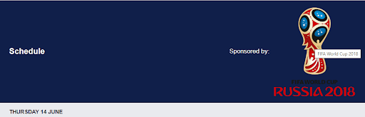
In the example below the ‘Sponsored by’ text is added to the sponsored_text parameter and the ‘FIFA World Cup 2018’ in the sponsored_image_alt_text parameter of the Schedule By League widget.
If the preferred image has been added to the widget, customizing the image can be done the same way as described in the previous chapter. The widget needs to be inspected and the header element needs to be selected. Afterwards all settings applicable to the image can be adjusted. These are examples of attributes that can be tweaked:
- Size of the image
- Alignment of the image
- Placement of the image
- Order of elements in the header
Sub headers
Sub headers are very different as opposed to headers. This is because sub headers can contain a very large number of things. Because of this, we don’t have title or sub title tags. Instead, we just have a single “children” tag, which can contain titles, subtitles or other text and icons. We do have a separate icon-wrapper tag with an icon tag inside of it. This is because we sometimes use these sub headers to collapse or expand other information. Find a screenshot below to get an understanding of how this looks and what we can adjust with these tags.
										.general__header__sub-header {
    background-color: rgb(242, 243, 246);
}

.general__header__sub-header__icon-wrapper {
    background-color: rgb(255, 255, 255);
}

.general__header__sub-header__icon-wrapper__icon {
    fill: rgb(10, 9, 28);
}

.general__header__sub-header__children {
    color: rgb(10, 9, 28);
    fill: rgb(10, 9, 28);
}
Some sub headers contain an icon wrapper (the white circle) and an icon (the black arrow). The text can be changed with the color property in the children tag, the color of the white circle can be changed with the background-color property in the icon_wrapper tag and the color of the arrow inside of that white circle can be changed with the fill property in the icon tag.
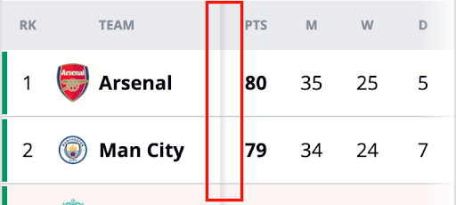
Table headers
With the help of some general__table tags the way the tables look can be changed. Currently only our table headers are styled in a specific way, using the following CSS:
										.general__table__head__row__cell {
    color: rgb(133, 143, 154);
    background-color: rgb(233, 234, 238);
}
Which looks like this for example:
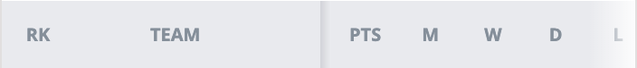
The background color and text color are different from the default ones. Changing the general__table__head__row__cell properties will change these colors accordingly.
Tabs
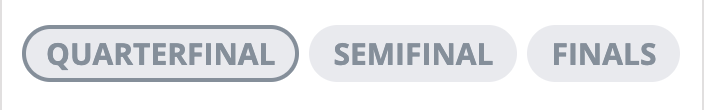
We have different kinds of tabs throughout the platform, but, rest assured, all of them can be adjusted with some general__tab tags. We will go through each one below. For each tab there is an “inactive” and an “active” state, which can be changed with custom CSS. Additionally, the “switcher” and “rounded” tabs have a default CSS which can be changed as well. Default tabs don’t have this default state as they consist out of plain text, as shown in the screenshots below.
Default tabs
Default tabs can be styled in the “inactive” and “active” state. Default tabs only contain some text and a border.
										.general__tab--inactive {
    color: rgb(133, 143, 154);
    border-color: transparent;
}

.general__tab--active {
    color: rgb(10, 9, 28);
    border-color: rgb(10, 9, 28);
}

Switcher tabs
“Switcher style” tabs are tabs which are connected to each other and are mostly used to switch between teams.
										.general__tab__switcher {
    background-color: rgb(242, 243, 246);
}

.general__tab__switcher--inactive {
    color: rgb(133, 143, 154);
    border-color: transparent;
}

.general__tab__switcher--active {
    color: rgb(10, 9, 28);
    border-color: rgb(133, 143, 154);
}

Rounded tabs
“Rounded style” tabs are another variant, which can be used in combination with the other 2. This is used to differentiate from the other tabs.
										.general__tab__rounded {
    color: rgb(133, 143, 154);
    background-color: rgb(233, 234, 238);
}

.general__tab__rounded--inactive {
    border-color: transparent;
}

.general__tab__rounded--active {
    border-color: rgb(133, 143, 154);
}
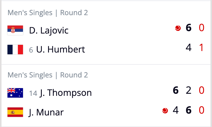
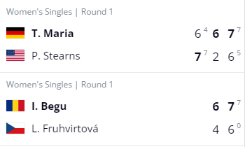
General scores
To be able to quickly change the way the score looks across several widgets the .general__score tag can be used. There are several sub tags we can use to differentiate between sup scores (tiebreakers in tennis for example), live scores, and non live scores.
										.general__score {
    // You can adjust things here for all general__scores
    // (both live and none live.)
}

.general__score--non-live {
    color: rgb(10, 9, 28);
}

.general__score--sup--non-live {
    color: rgb(133, 143, 154);
}

.general__score--live,
.general__score--sup--live {
    color: rgb(214, 0, 0);
}
An example of live scores (red) and non live scores (black).
An example with non live sup scores (tiebreakers):
Live score in the Match Detail widget (only the score in the red squared box will be affected):
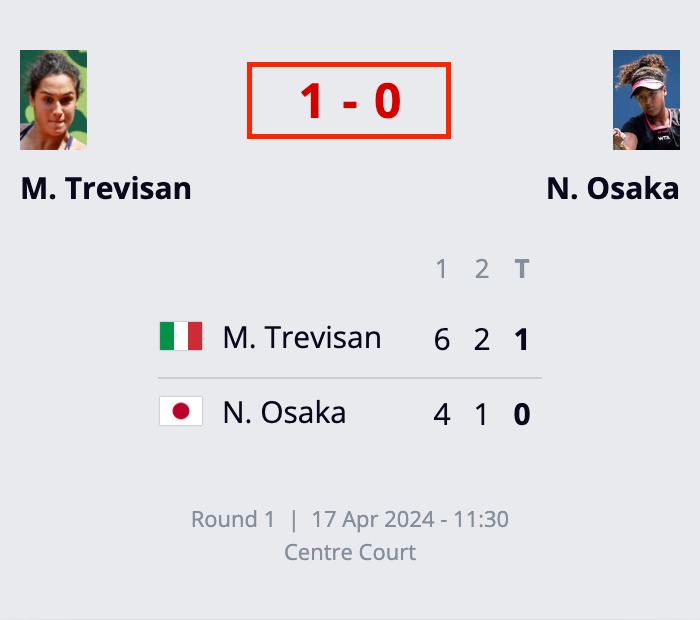
All of the above examples are adjustable with the .general__score tags.
Dropdowns
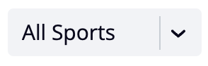
The .general__dropdown__select and .general__dropdown__icon tags can modify dropdowns a little bit. We might expand this functionality at a later stage, but right now it is mostly limited to the Bracket and Schedule widget dropdowns.
With these tags the background color of the select box can be changed, as well as the border color to the left of the icon.
										.general__dropdown__select {
    background-color: rgb(242, 243, 246);
}

.general__dropdown__icon {
    border-color: rgb(201, 206, 212);
}
Dropdown with a background and icon border example (the border being the line between all sports and the arrow icon):
Links
One of the methods of linking, other than buttons, are “normal” links. These can be targeted with the .general__link tag. We have normal links and themed links. Themed links by default have a light blue color, sometimes paired with icons. These icons can also be targeted with a specific tag. See below.
										.general__link {
    background-color: transparent;
}

.general__link--themed {
    color: rgb(100, 149, 186);
}

.general__link__icon--themed {
    fill: rgb(100, 149, 186);
}
A themed link without an icon:
A themed link with icons:
Scrollbars
Our scrollbars can be easily adjusted with the following tags. These scrollbars are shown when tabs or tables don’t fit entirely on a specific viewport.
										@media (hover: hover) {
    .styled-scrollbar::-webkit-scrollbar {
        -webkit-appearance: none;
        width: 7px;
        height: 7px;
    }
    .styled-scrollbar::-webkit-scrollbar-thumb {
        border-radius: 4px;
        background-color: rgb(201, 206, 212);
        -webkit-box-shadow: 0 0 0 rgb(255, 255, 255);
    }
}
Color classes
Besides changing specific elements throughout our widget portfolio using the general classes described above it is also possible to target specific colors used. These colors are also part of the Custom CSS file and can therefore be changed. Keep in mind that changing these specific colors can have impact on multiple places and colors sometimes have different functions. In one widget the color can be used for a table header for example, where in another widget the same color is also used for an element with a totally different function. Changing color classes instead of the above described general classes is therefore not without any risk.
“Primary” color
This is the default theme color. It is also the color being used by our general__header.
Below is a list of CSS classes which use this color by default.
										.color__background--primary {
    background-color: rgb(16, 31, 74);
}
.color__fill--primary {
    fill: rgb(16, 31, 74);
}

“Light” color (also default background color)
This is the default light color, as well as the default background color. Currently this color is white.
										.color__text--light {
    color: rgb(255, 255, 255);
}
.color__background {
    background-color: rgb(255, 255, 255);
}
.color__border--light {
    border-color: rgb(255, 255, 255);
}
.color__fill--light {
    fill: rgb(255, 255, 255);
}
Default text and icon fill color
This is the default text and icon fill color. It is also used as a background and border color in some specific cases.
										.color__text,
.color__text--hover:hover,
.color__text--active:active,
.color__text--focus:focus,
.color__text--visited:visited {
    color: rgb(10, 9, 28);
}
.color__background--dark,
.color__background--dark--hover:hover {
    background-color: rgb(10, 9, 28);
}
.color__border--dark {
    border-color: rgb(10, 9, 28);
}
.color__fill {
    fill: rgb(10, 9, 28);
}

Secondary text and icon fill color
This is the secondary text and icon fill color. It is also used as a background and border color in some specific cases.
										.color__text--secondary,
.color__text--secondary--hover:hover,
.color__text--secondary--active:active,
.color__text--secondary--focus:focus,
.color__text--secondary--visited:visited {
    color: rgb(133, 143, 154);
}
.color__border--tertiary {
    border-color: rgb(133, 143, 154);
}
.color__fill--secondary {
    fill: rgb(133, 143, 154);
}

Secondary border color
This is the secondary border color.
										.color__border--secondary {
    border-color: rgb(201, 206, 212);
}

Tertiary text and fill color and default border color
This is the tertiary text and fill color. This is also the default border color and this color is also used as a background color in some specific cases.
										.color__text--tertiary {
    color: rgb(233, 234, 238);
}
.color__background--secondary--dark {
    background-color: rgb(233, 234, 238);
}
.color__border,
.color__border--before::before,
.color__border--after::after {
    border-color: rgb(233, 234, 238);
}
.color__fill--tertiary {
    fill: rgb(233, 234, 238);
}

Default call to action color
This is the call to action color. It is also used as the color to show the degrading team at the bottom of the standings table and to show missed penalties in Football (Soccer) matches.
										.color__text--cta {
    color: rgb(214, 0, 0);
}
.color__background--cta,
.color__background--penalty-missed {
    background-color: rgb(214, 0, 0);
}
.color__border--cta {
    border-color: rgb(214, 0, 0);
}
.color__fill--cta {
    fill: rgb(214, 0, 0);
}

Secondary call to action color
This is the secondary call to action color. It is also used as the color to show scored penalties in Football (Soccer) matches.
										.color__text--cta--secondary {
    color: rgb(0, 153, 102);
}
.color__background--cta--secondary,
.color__background--penalty-goal {
    background-color: rgb(0, 153, 102);
}
.color__border--cta--secondary {
    border-color: rgb(0, 153, 102);
}
.color__fill--cta--secondary {
    fill: rgb(0, 153, 102);
}

Highlight color
This is the color used to highlight specified teams in tables. It is basically the call to action color with an opacity of 10%, but unfortunately, opacity cannot be used in some fixed tables.
Because of this, this color needs to be defined without opacity.
										.color__background--cta--highlight {
    background-color: rgb(252, 244, 243);
}

Primary light color
This color is used mainly in Match Detail for Line-ups, the Wave, Team Stats, and many other places. It is a lighter version of the primary color, hence the name.
										.color__text--primary--light {
    color: rgb(100, 149, 186);
}
.color__background--tertiary {
    background-color: rgb(100, 149, 186);
}
.color__border--primary--light {
    border-color: rgb(100, 149, 186);
}
.color__fill--primary--light {
    fill: rgb(100, 149, 186);
}

Secondary background color
This is the secondary background color. This color is the most frequently used alternative background color.
										.color__background--secondary,
.color__background--secondary--hover:hover {
    background-color: rgb(242, 243, 246);
}

Gold color
This color is used for gold medals.

Silver color
This color is used for silver medals.
										.color__background--silver {
    background-color: rgb(178, 187, 197);
}
.color__border--silver {
    border-color: rgb(178, 187, 197);
}
.color__fill--silver {
    fill: rgb(178, 187, 197);
}

Bronze color
This color is used for bronze medals.
										.color__background--bronze {
    background-color: rgb(214, 169, 108);
}
.color__border--bronze {
    border-color: rgb(214, 169, 108);
}
.color__fill--bronze {
    fill: rgb(214, 169, 108);
}

Transparent colors
These classes give a transparent background to some of our elements. We highly recommend leaving these transparent, as any other color might break the widget designs. Change these at your own risk.
										.color__background--transparent {
    background-color: transparent;
}
.color__border--transparent {
    border-color: transparent;
}
Legend colors
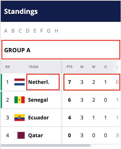
Below a list of legend colors can be found, which are used in the Standings widget to highlight teams who will, with the current standings, qualify for (continental) club cup tournaments, promote to a higher league or relegate from their current league. These colors are currently only available for Football (Soccer).
The names of the classes indicates if this color is shown at the top or at the bottom of the standings table.
										.color__background--legend-top1 {
    background-color: rgb(0, 153, 102);
}
.color__border--legend-top1 {
    border-color: rgb(0, 153, 102);
}
.color__background--legend-top2 {
    background-color: rgb(97, 211, 255);
}
.color__border--legend-top2 {
    border-color: rgb(97, 211, 255);
}
.color__background--legend-top3 {
    background-color: rgb(0, 36, 153);
}
.color__border--legend-top3 {
    border-color: rgb(0, 36, 153);
}
.color__background--legend-top4 {
    background-color: rgb(255, 204, 21);
}
.color__border--legend-top4 {
    border-color: rgb(255, 204, 21);
}
.color__background--legend-top5 {
    background-color: rgb(133, 143, 154);
}
.color__border--legend-top5 {
    border-color: rgb(133, 143, 154);
}
.color__background--legend-bottom1 {
    background-color: rgb(214, 0, 0);
}
.color__border--legend-bottom1 {
    border-color: rgb(214, 0, 0);
}
.color__background--legend-bottom2 {
    background-color: rgb(255, 146, 80);
}
.color__border--legend-bottom2 {
    border-color: rgb(255, 146, 80);
}
.color__background--legend-bottom3 {
    background-color: rgb(242, 137, 194);
}
.color__border--legend-bottom3 {
    border-color: rgb(242, 137, 194);
}
Gradients
Our widgets also use some gradients. Let’s go over the different gradients, and how changing them will impact the widgets.
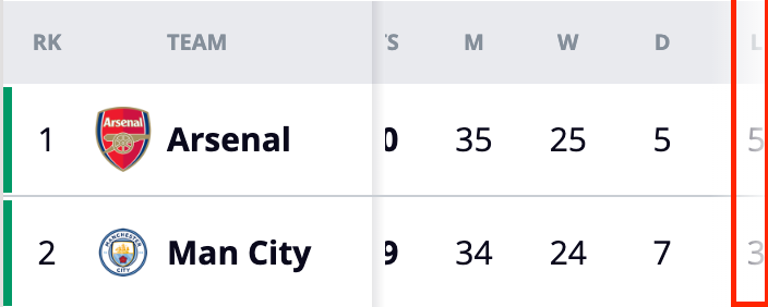
.linear-gradient-dark-to-light is used in scrollable tables, to indicate which part of the table is scrollable, as shown in the screenshot below. It is recommended to keep the light color in sync with your background color.
										.linear-gradient-dark-to-light,
.linear-gradient-dark-to-light--after::after,
.linear-gradient-dark-to-light--first-child:first-child,
.linear-gradient-dark-to-light--first-child--after:first-child::after {
    background: linear-gradient(to right, rgb(10, 9, 28), rgb(255, 255, 255));
}
.linear-gradient-transparent-to-light is used in a variety of widgets, where you are able to scroll to the right side. This smoothens the look of the widget and signals the user there is more content on the right side of the widget. It is recommended to change the light color if you also change the background color on the body tag.
										.linear-gradient-transparent-to-light,
.linear-gradient-transparent-to-light--after::after,
.linear-gradient-transparent-to-light--before::before,
.linear-gradient-transparent-to-light--nth-child-2--before:nth-child(2)::before {
    background: linear-gradient(to right, transparent 0%, rgb(255, 255, 255) 100%);
}
.linear-gradient-light-to-transparent is used in a variety of widgets where it is able to scroll to the left side. This smoothens the look of the widget and signals the user there is more content on the left side of the widget. It is recommended to change the light color if you also change the background color on the body tag.
										.linear-gradient-light-to-transparent,
.linear-gradient-light-to-transparent--before::before {
    background: linear-gradient(to right, rgb(255, 255, 255) 0%, transparent 100%);
}
.linear-gradient-transparent-to-light-to-transparent is used in the Carousel widget dropdowns, to make for a smoother look of the dropdown. It is recommended to change the light color if you also change the background color on the body tag.
										.linear-gradient-transparent-to-light-to-transparent,
.linear-gradient-transparent-to-light-to-transparent--after::after {
    background: linear-gradient(to right, transparent, transparent 60%, rgb(255, 255, 255) 83%, transparent 84%);
}
.linear-gradient-dark-to-light-to-bottom is used in the Standings widget to make for a smoother look of the widget. It is recommended to change the light color if you also change the background color on the body tag.
										.linear-gradient-dark-to-light-to-bottom,
.linear-gradient-dark-to-light-to-bottom--after::after {
    background: linear-gradient(to bottom, rgb(10, 9, 28) 0%, rgb(255, 255, 255) 100%);
}
Event Center Custom CSS
We can deliver an Event Center as an off the shelf product to combine multiple widgets in one solution.
In all Event Center there are two stylesheets:
- One for the widgets within the Event Center, which is referenced in the previous chapters.
- One for the upper part of the Event Center (that includes the title and navigation to the separate widgets).
Here is an example of the eventcenter-custom.css:
										@charset "UTF-8";
/* Uncomment this to call in a different google font
@import url('https://fonts.googleapis.com/css2?family=Open+Sans:wght@400;600;700&display=swap'); */


/*############################################################################*\


    GRACENOTE OLYMPICS EVENT CENTER -- Outer Frame (header and navigation)


--------------------------------------------------------------------------------


Index:
	Fonts
	Header
	Navigation


--------------------------------------------------------------------------------


Creation Date: Oct 22/21
File: eventcenter-custom.css
Description: This is a custom stylesheet for Gracenote Olympics Event Centers.
Clients can use this to override the styles of the header and navigation.
Sample styles are given below, but feel free to make any changes you like.
Note that these styles are duplicated from the default stylesheet, so deleting them won't hurt anything.
A different google font can be called in by uncommenting the import call at the very top of the file.


\*############################################################################*/


@import url("https://assets.sports.gracenote.com/opb2022/styles/eventcenter-base.css");


/*############################################################################*\
	FONTS
\*############################################################################*/


body { /* This changes the base font */
	/* font-family: "Open Sans", Arial, sans-serif; */
}


/*############################################################################*\
	HEADER
\*############################################################################*/


header,
.nav__dropdown { /* background color of header and menu dropdown */
	/* background-color: #902430; */
}


header > span { /* Font color and size of page title */
	/* font-size: 24px;
	font-weight: bold; */
}


/*############################################################################*\
	NAVIGATION
\*############################################################################*/


nav { /* Size of the navigation links */
	/* font-size: 16px; */
}


a { /* Color of the navigation links */
	/* color: #fff; */
}


a:hover, a:focus, a:active, a.active { /* Hover, selected color of navigation links */
	/* color: #fff; */
}


a:hover, a.active { /* Hover behavior of navigation links */
	/* border-bottom: 1px solid #fff; */
}


button { /* Replace the button image if you like */
    /* background: url(../img/menu-open.png) no-repeat 50%; */
}


button.is-open {
    /* background: url(../img/menu-close.png) no-repeat 50%; */
}


button.nav__dropdown-toggle { /* Change the border around the image */
	/* 1px solid #Ba7480; */
}
As for the implementation of the Event Center upper part stylesheet:
- Send us the location of the CSS file (where you host them), so we will link it to the Event Center. Any changes you make in the CSS file will then automatically be published.